Trendy Tuesday – Bright Colors
by Katherine Elliot
BRIGHT colors are looking HOT this summer!
Put on your sunglasses and check out some of these bright ideas using pops of color in a big way. The first card I found makes creative use of bright colored Post-It note papers. If you don”t have bright color cardstock readily on hand, think of what else you can create. You may have to play with this fun trend.
 image source papercraftsconnection.com
Bright colors are fun to play with and are perfect for summer time crafts for parties. Click on the image source link to see more fun cupcake and party decorations like the ones shown below.
 image source waffleflower paper crafts
Neon bright colors are by all means eye catching. The card below shows neon layers and a die cut image combined with crisp white to look bright and fresh.
Retro Phone card by Jesse Rone; image source Can you say addicted to stamps?
Patterned papers provide many choices in bold colors that you can use to inspire yourself to break out of a monochromatic mode.
Jillibean Soup Butter Beans scrapbook paper, image source twopeasinabucket.com
If you are looking for summer time inspiration, then a themed patterned paper pack is perfect to add a dash of bright island flair or any pop of color that may be out of your usual comfort zone.
Echo Park Paradise Beach paper, image source bluemoonscrapbooking.com
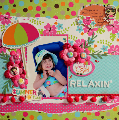
A fresh scrapbook page like the ones shown below will quickly stand out from competing pages which may be suffering from “the winter blues.”

Imaginisce paper, Makin” Waves, scrapbook page image source imaginisce.blogspot

Summertime Favorites scrapbook page featuring Little Yellow Bicycle “Splash” Collection, image source mylyb.com
“Sixteen” digital scrapbook page, image source from A Cherry On Top
Toned-down, not quite so neon-bright colors, can combine to look fresh and vibrant like in the card below featuring Stampin” Up! Summer Smooches paper and coordinating Bright Blossoms stamp set. The artistic reference to the colorful works of Andy Warhol in this next card is also very chic.
Warhol Blossoms card by Cindy Major, image source CindyMajor.typepad.com
A neutral black background, with punched images of bright butterflies showcased in the card below demonstrate another easy way to combine bold colors.
Bright Butterfly Birthday card featuring images and die cuts from Stampin” Up!, by Jennifer Brum, image source Ladybug Designs
Bold colors are for everyone and every gender. These colors can be “girlie” when used for pretty bright flowers and butterfly accents…
Bugaboo flower trio card by Elaine Stark, image source Simpli Crafti

D. Daisy”s card and treat holder featuring Stampin” Up! Summer Smooches paper, image source splitcoaststampers.com
Or the colors can be combined for the perfect card for any boy. The brightly colored green monster here looks fantastic combined with a color similar to Pantone”s , Spring 2012 HOT color of the year, Tangerine Tango (an orange color). Oh, and you”ve gotta love those googly eyes!!
image source meine-bastelarena
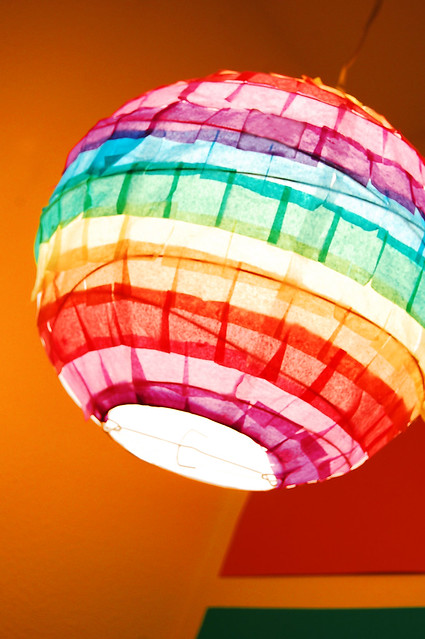
Craving even more BRIGHT color ideas outside your usual crafts? Check out this festive tissue paper decorated lantern from a very creative designer, Alexa Westerfield…
 DIY instructions and image source from swelldesigner.blogspot.com
Do you have enough bright ideas now? I hope so! But of course, we”re always seeking out more fun trends and inspiring images for you, so keep the blog bookmarked.
Enjoy & happy crafting!

Wow! All those bright colours give me the summer-feeling!! Cool!
LOVE the bright n cheery projects:) SUPER ideas—very inspirational:) be blessed
~Beyond Measure
Tammy
http://www.urbeyondmeasure.com
Super inspiration! Thanks so much for all these ‘brillant’ ideas 😉
Great summery brights!
Well, I can’t say you didn’t warn me to put on my sunglasses. Love the neon colors!!!! I especially like the telephone and monster cards. Too darned stinkin’ cute!
Love these colors–they pop!
I LOVE these BRIGHT colors; I am *so* trying to overcome my TIm Holtz-induced habit of dimming everything down with the muted colors of the traditional distress ink line (I find that I can’t help myself sometimes, and even when I start out with my bright golds and pinks and acid greens, I go and ink it to death….).
Today’s challenge is to LEAVE THE BRIGHTNESS BE…. Lol! I’m going to copy that telephone card look….very reminiscent of my youth (yes, I am *old*…)
~sissun, 062812