I don’t know about what you see when you look out of the window, but here in Minnesota, there is white stuff everywhere; although maybe not as much as in Buffalo NY but still. I love how creative people use everything they see and this week I want to focus on the monochromatic trend. Because of the season, most of my selections are white on white but that is not the only way to take advantage of the trend and I’ll show you a few examples of that. I hope you find something inspiring to try this week or can just imagine a snow-filled world a bit better.
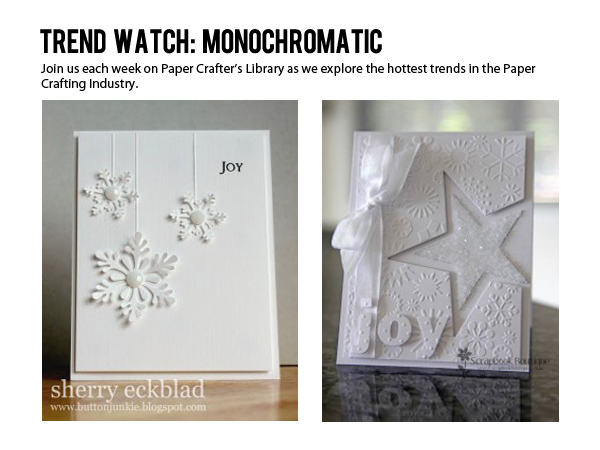
I love the art deco style Laurie used on this card. The white embossing on the white vellum is so cool. It looks neat and clean like a set of high-end hotel sheets.
card by Laurie Willison photo courtesy of Soapbox Creations
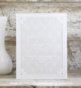
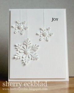
Another crisp and clean card by Sherry. How awesome are the embossed lines in keeping the same color of the background paper and using the snowflakes in a new way?
card by Sherry Eckblad photo courtesy of Button Junkie
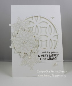
Karren used a die as the center point and a few snowflakes to give her Christmas card a white on white look.
card by Karren photo courtesy of Karren J – Stamping Stuff
I just love the negative space and the glitter on the star Tillymint created. Even in the all white environment, there is so much to look at and so many textures in this card.
card by Tillymint photo courtesy of Splitcoast stampers
This card makes me feel calm just looking at it. Cover plates are a great way to get a monochromatic look by coordinating background paper.
Card by Kim S photo courtesy of Joyful Creations with Kim
The sweet touches of pale pink on the inside of the flower petals in this card make it so lovely. Paula also shows us a great way to layer the same color paper on paper using a die cut negative.
card by Paula Knall photo courtesy of Knall Crafting
This next card uses a similar color pallet and increases the concentration of pigment to create a unified design. The color added also creates cool dimension as well.
card by Louise Sharp photo courtesy of Louise Sharp Independent Stampin Up demonstrator – Australia
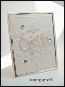
I am a major fan of the metallic mirror shiny paper being used lately. Just a bit of a pop of color totally pulls together the joy and the snowflake on this pretty card.
card by Laurie photo courtesy of Stampin up North
This card is just lovely! Andrea inked the inside of an embossing folder to create the soft look of the snowflakes.
card by Andrea Ewen photo courtesy of Ewen Style
Tan and beige colors can look very pulled together and work for several styles of card. I love the unconventional look of this women’s empowerment card in the softer colors.
card by Kimberly Van Diepen photo courtesy of Stampin by the Sea
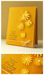
As promised, here is a non white example of this cool monochromatic trend. Attaching the flowers gives this card depth and the colors are so warm.
card by Mariana Grigsby photo courtesy of Mariana Grigsby’s blog
It is so cool to achieve interesting depth and texture by using the same or similar colors. The look can be clean and simple to shabby chic. Use some of the work as inspiration or look outside of your snowy window and create your own look.
So go ahead… make something pretty.
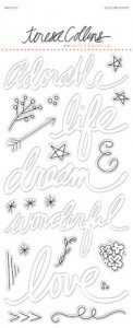
I found a few products that might offer even more inspiration.








Thank you for the wonderful article. I always enjoy reading your trend watch articles. Keep up the good work.
I am only just beginning to enjoy the sophisticated look of white on white. Thanks for all these wonderful examples!
Love the look of white on white – so elegant.
isoscia at aol dot com