This is my kind of watercolor! It is beautiful and colorful but I don’t have to stay within the lines to make a something awesome.
It reminds me a bit of the freedom you had to create when you were in kindergarten. You were given a piece of paper and some paints and told to go at it. The abstract design and color combinations were accidental and every once in awhile, you could see something almost brilliant in the randomness of your finished masterpiece.
Messy watercolor is a bit like that. It is a lot more free form and does not require you be exact with your paint brush. And accidents are often the most beautiful! If watercolor had been intimidating, messy watercolor might be a great way to try this exciting trend.
One of the first things I created when I was practicing drawing as a kid was a rainbow. I love the take on the rainbow here with each color blending into the other with ease and acceptance of the overlap and a general flow along the edge of the card. This is a really nice effect and the butterflies just highlight it.
card by Tobi photo courtesy of Tobi’s Place
Francine had a similar take and included the butterfly in the rainbow and gave the last color a few flicks for a cool dripped or spotted look.
card by Francine Vuilleme photo courtesy of 1001 Cartes
You can use distress inks, water colors or spray paints to get vibrant colors like in the card below. The techniques to get the color are on card are limited only by your imagination. I love the look of the smoosh look this musically inspired card.
Card by Diana Nguyen photo courtesy of Yours Truly
You can still hold the general shape of a stamped image or a die cut like Jocelyn used and not focus too hard about staying in the lines. I love this look. It creates a halo of color that is very forgiving.
card by Jocelyn Olson photo courtesy of Red Balloon Cards
Brenda dedicated a blog post to how to recreate with a “mess up” to create this card. Stamping over watercolor is another great look and creates a cool collage look.
card by Brenda Weaver photo courtesy of Sweet Paper Treats
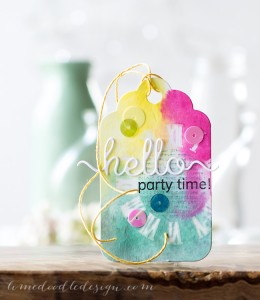
This sweet tag that Debby created is just beautiful. I love the concentration of color and the masked look she picks with with the clock in the background.
tag by Debby Hughes photo courtesy of Lime Doodle Designs
Laura’s stamped skyline looks like modern art with the different colors general suggesting where the buildings begin and end.
card by Laura Bassen photo courtesy of Doublestick Heaven
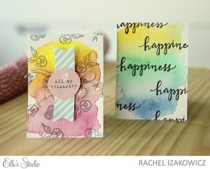
You can test several color combinations together, let them dry and stamp or emboss over them for awesome pocket pages.
cards by Rachel Izakowicz photo courtesy of Seize the Stamp
I love that you can get a watercolor look with the things you have on hand. This awesome collage was created with watered down acrylic paints and washi tape and a few stamps.
page by Missy Whidden photo courtesy of Shimelle.com
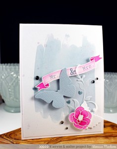
You can create your own background palate by using one color to ground the rest of your paper art. I love the color combination in this card.
card by Vanessa Menhorn photo courtesy of Wings of a Butterfly
The light blue wash is the perfect background for the watercolor flower combination.
card by Dawn Woleslagle photo courtesy of W Plus 9 blog
Freedom in crafting is here. Use the materials you have, try different techniques for different looks and most of all don’t worry about staying within the lines. Long live messy watercolor!!!
So go ahead…, make something pretty.
I found a few product below to start you on your messy journey.
Prima watercolor pencils from Scrapbook.com
Ranger Watercolor Paper from Scrapbook.com
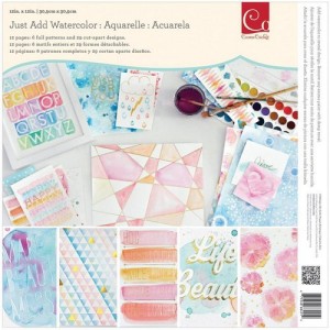
Cosmo Cricket watercolor paper pad from Scrapbook.com
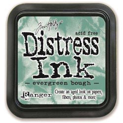
Distress Ink from Ranger Ink Store
Distress Spray Stain from Ranger Ink Store







I love the look of watercolor and all these cards are just fabulous. I can’t wait to try some of these ideas for watercoloring on some cards. Thanks so much for sharing these great looks!